CI
The Seoyon Group, which has grown into a total auto parts company that has overcome numerous competitions and challenges since its establishment in 1972, expresses its corporate spirit of actively moving forward for a bigger leap in the rapidly changing global market with its mission and CI (corporate identity).
- About CI
- Criteria for use
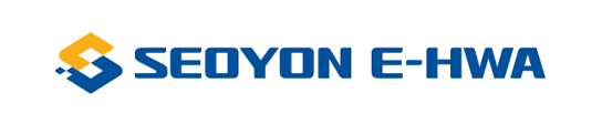
Corporate Symbol
-
-
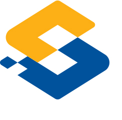
The overall image of the identity mark continues the corporate spirit by implying five diamonds that symbolize the spirit of harmony, the realization of values, respect for humanity, and trust, which are the origins of Seoyon, in two diamonds. The diamond shape in yellow represents love and sharing, as well as human-centered ethical management, and the diamond in blue symbolizes global vision and trust for the future.
Two diamonds of the vision that are the result of two colored diamonds being merged are newly included to express the will to create greater global synergy. The shape of the mark and the S are expressed in a stylish way. The S of Seoyon, which is the subject, and S of innovative smart management of a global leader are combined together as one and stand for the S of great synergy creation. Also, the new identity spirit of Seoyon embodies the meaning of public interest to fulfill our responsibilities for automotive technology and development and to position ourselves as a social company with a vision as a leading company in the global market.
Logo Guidelines
-
-
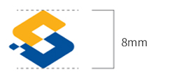
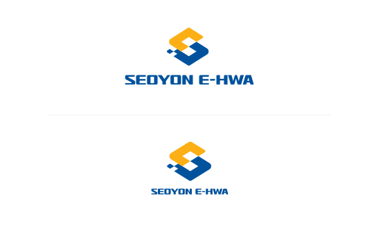
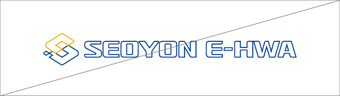
- The corporate symbol of Seoyon E-Hwa is used in all media representing Seoyon E-Hwa and plays an important role in delivering the image.
- Therefore, its shape and color shall be maintained and used for consistent image delivery, and since the minimum use of the corporate symbol is set in consideration of the reproducibility of the symbol, the use of smaller than the minimum size is prohibited as much as possible.
Logo Types
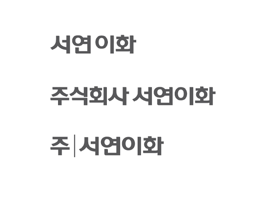
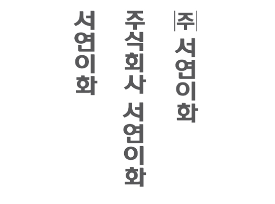
Korean
-
The Korean logo type is a unique design of Seoyon E-Hwa and shall not be altered under any circumstances. The vertical type is used when it is necessary to indicate the company name in a situation where the use of the logo is not applicable, such as when signing.
Horizontal Type
Vertical Type
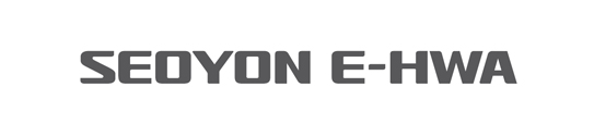
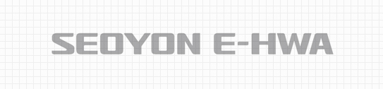
English
-
The English logo type was developed in consideration of harmony with the corporate symbol, and since it is a unique design of Seoyon E-Hwa, it shall not be altered under any circumstances.
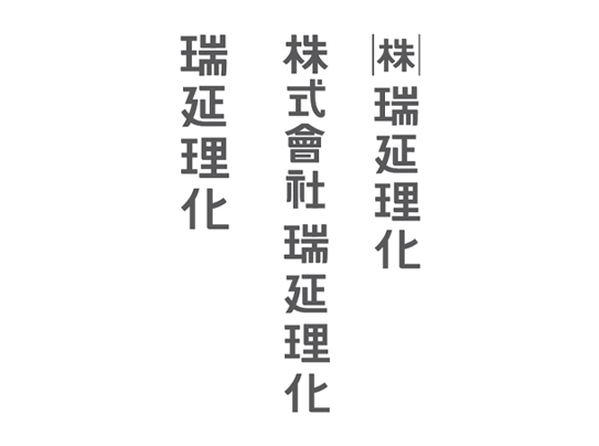
Chinese
-
The Chinese logo type is a unique design of Seoyon E-Hwa and shall not be altered under any circumstances. The vertical type is used when it is necessary to indicate the company name in a situation where the use of the horizontal logo type is not applicable, such as when using a vertical signature.
Horizontal Type
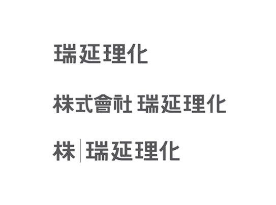
Vertical Type
Signature
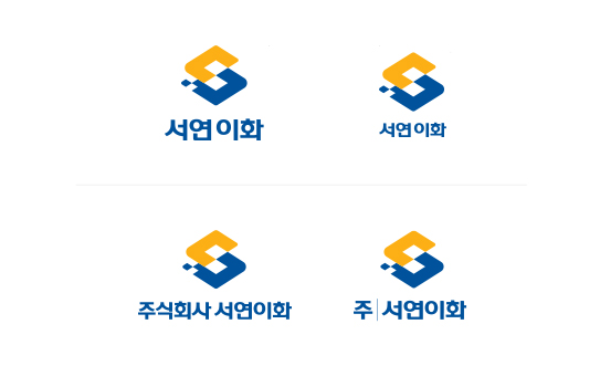
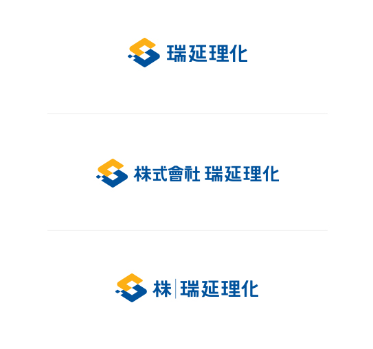
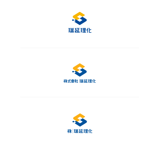
Korean
-
The Korean signature system is a combination of the corporate symbol and the Korean logo type according to certain rules, and shall not be changed and used arbitrarily.
Left-Right Combination Type
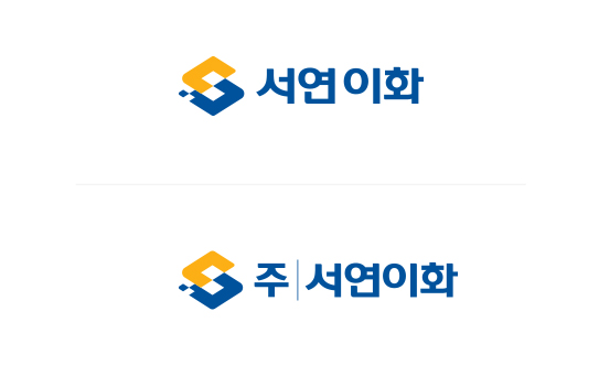
Top-Bottom Combination Type
English
-
The English signature system is a combination of the corporate symbol and the English logo type according to certain rules, and shall not be changed and used arbitrarily.
Left-Right Combination Type
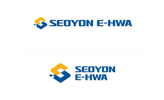
Top-Bottom Combination Type
Chinese
-
The Chinese signature system is a combination of the corporate symbol and the Chinese logo type according to certain rules, and shall not be changed and used arbitrarily.
Left-Right Combination Type
Top-Bottom Combination Type
-
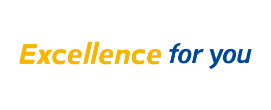
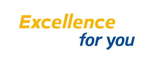
Slogan
-
The slogan is an element that expresses the image and will of Seoyon E-Hwa in internal and external communications, and was designed by inducing a connection with the identity.
Left-Right Combination Type
Top-Bottom Combination Type
-
Color Standards
-
The exclusive colors of Seoyon E-Hwa are used throughout the BASIC SYSTEM as well as APPLICATION SYSTEM and are an important element in forming a unified visual image.
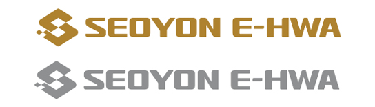
The basic colors are SEOYON BLUE and SEOYON YELLOW. However, in the case of CMYK printing due to the nature of the applied medium, it shall be expressed according to the PROCESS COLOR ratio presented below.Main Colors
PANTONE 287C
R0 G80 B155 / C100 M70 Y0 K10
PANTONE 130C
R250 G175 B25 / C0 M35 Y100 K10
Sub Colors
PANTONE Coll Gray 6C
R190 G190 B190 / C0 M0 Y0 K30
PANTONE Cool Gray 11C
R110 G110 B110 / C0 M0 Y0 K70
-
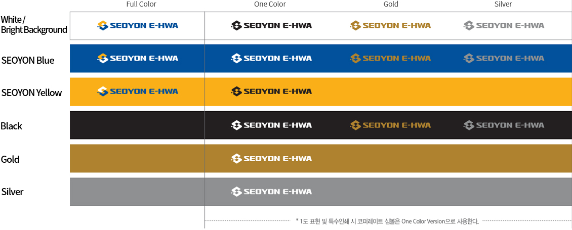
Use of Colors
-
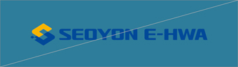
It is most desirable to use the corporate symbol in the Full Color Version on a bright background for effective expression. However, it shall be produced in compliance with the application examples for single tone printing and special printing in the case of the characteristics of the operating environment or CMYK printing not being applicable. The use of colors requires thorough management for the delivery of a consistent image, and the image shall not be damaged by arbitrarily altering it.
Basic Colors
Grey Scale
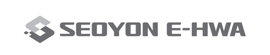
For Black and White Printing
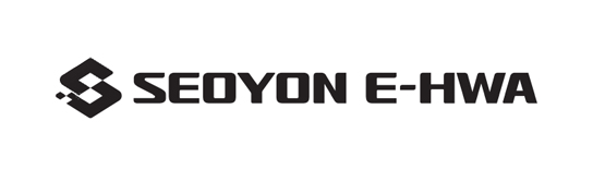
For Special Printing
-
Use of Colors According to Background Colors
Bright Background -
-
Guidelines on Prohibition of Use
-
Since the original image may be damaged and the communication effect may deteriorate in the case of the shape or color of the identity being altered due to the use of an inappropriate manuscript of arbitrary interpretation of the user, the stipulated rules shall be followed when reproducing the identity. The examples in this section illustrate common misuse cases by type. It shall be thoroughly managed with reference to them so that alterations do not occur in any case.
Adjusting the size arbitrarily
Using colors other than the specified ones
Adjusting the space between letters arbitrarily
Slanting the letters
deforming the shape
Appling the identity to a specific form
Treating the identity with lines
Placing over a strong-colored background
Placing over a strong-patterned background or a photo